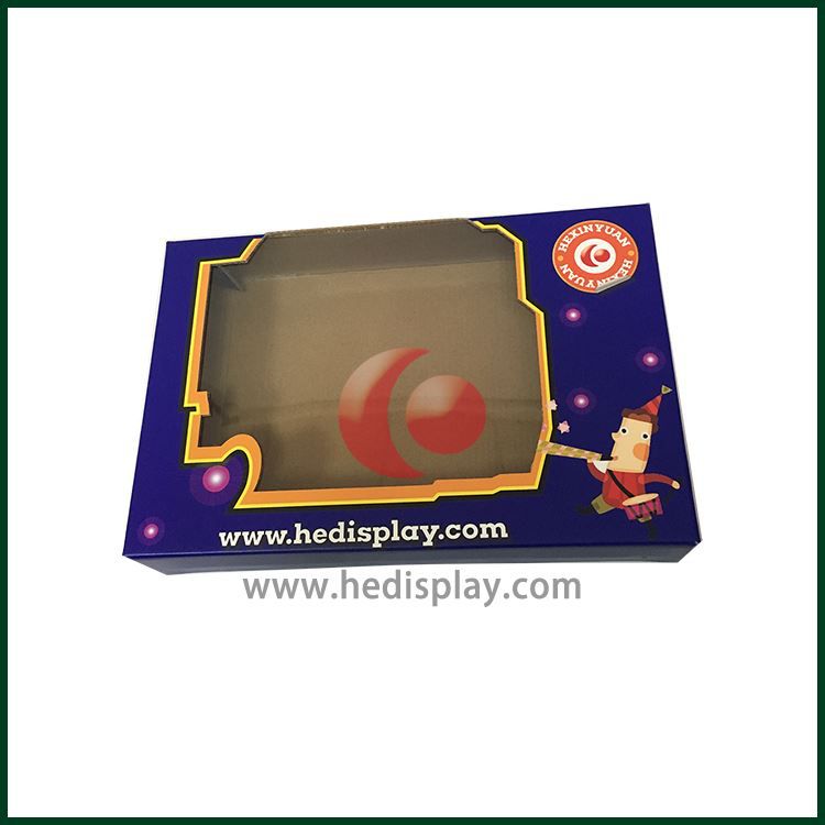
Besides, the contrast between color and color. This is the easiest thing to show in many commodity packaging but very difficult to grasp. In the design, it comes from a master, the wound effect of the packaging is sunny and white, on the contrary, it is the lower Liba. In Chinese calligraphy and painting, there is often a term that is called ``secret, impermeable, and sparsely able to be happy. In fact, it is a contrast relationship. In packaging design, this contrast relationship is very obvious and very common. These so-called contrasts generally have the following contrasts: namely, the depth contrast of color use, the light and heavy contrast of color use, the point-to-face ratio of color use, the complicated and simple contrast of color use, the elegant and popular contrast of color use, and the contrast of color use. Contrast and so on.

 English
 русский
 Italiano
 Deutsch
 Türkçe
 Português
 한국어
한국어 日本語
日本語 Français
 عر
عر Việt Nam
 Español